I was hired to redesign a website for a professor and scholar.
Here’s what the mobile site looked like before I started:
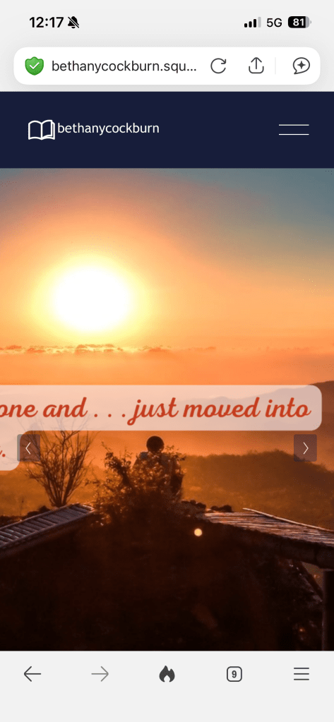
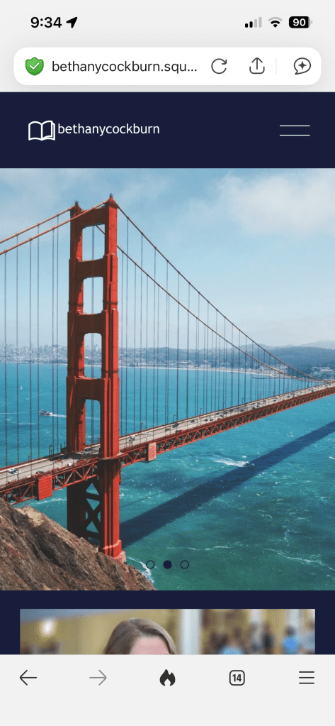
My client recognized several flaws with the site, especially the mobile version. I asked her about her goals for the website, and she said that she wanted to make visually more appealing and easier for her colleagues and students to use. With this information, I implemented a design process to improve the website and make it more user-friendly.
Empathize
First, I had to think about what types of users would be using her site, and then reach out to people who fit that category so I could determine what they were looking for when they visited. After interviewing several people that my client and I identified as potential users, I created user personas and user journeys.
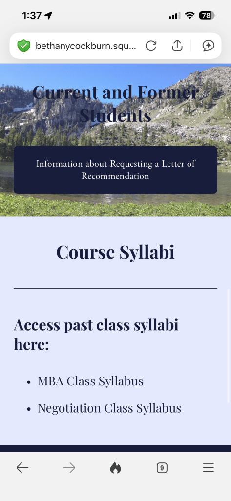
- José is a student in one of Prof. Cockburn’s classes who is looking for information about how to ask for a letter of recommendation for his summer internship. He finds the cluttered design of the website hard to navigate.
- Tasha is a visually impaired colleague who met Prof. Cockburn at a conference who is interested in collaborating in the future. She has difficulty reading some of the text because of font and color choices.
José and Tasha would have very different user journeys.
- José needs to:
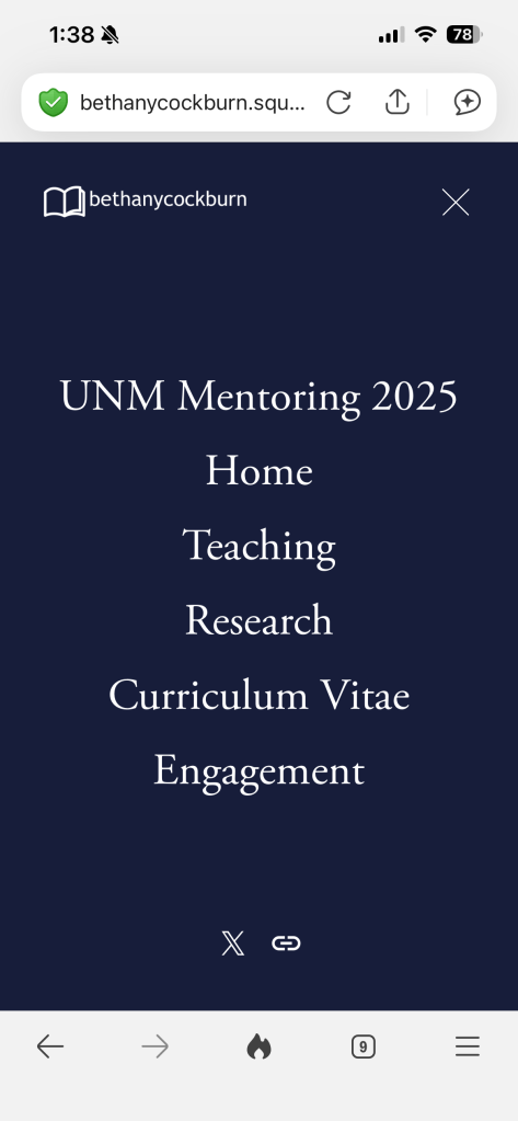
- Log onto the site
- Find the sub-menu and navigate to a page that offers information for current students
- Find a “For Requesting Letters” button that will take him an form he can fill out requesting a letter of rec
- Receive an email confirming his request has been sent
- Tasha needs to:
- Look up her colleague’s website
- Maneuver to a page about Prof. Cockburn’s research that she can read
- Find a link to Prof. Cockburn’s contact information so she can reach out
Define
The current format of the mobile site created several pain points for both of our users. They had difficulty reading the text because of the colors and busy backgrounds, and they didn’t know where to go to find the information they needed.
We came up with several hypotheses about what would improve their user experience:
- If José were able to navigate the website more easily on his phone after class, he could find the form to submit instead of emailing the professor.
- If Tasha could read the headings and the text on her phone more easily, she would not forget to contact Prof. Cockburn because be able to find the information she is looking for immediately.
This lead to the ultimate definition of the problem: I needed to alter the website so that it was easier to read the text and easier to navigate.
Ideate
At this stage I started to look at other professional website across disciplines, focusing especially on academic sites. I also sketched several prototypes to show my client and other designers to receive feedback. I was careful to consider especially what information would be necessary to have show up on the home page.
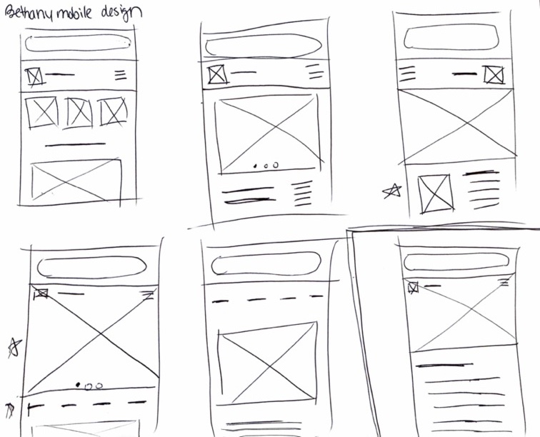
Prototype
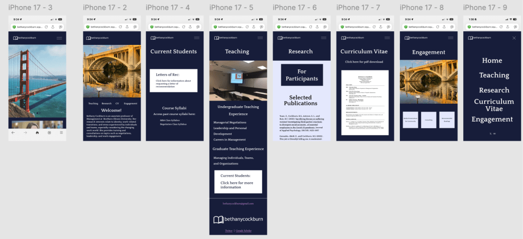
Once I had decided on a basic idea of what the site should look like, I turned to Figma to create a few more wireframes.
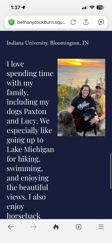
From there, I created high-fi prototypes of the site so that I could show my client the new design. The client had a few visual elements that were really important to her, such as the image of the bridge. I changed the generic bridge image she had to a photo of a local landmark to give the website a more personal touch. I implemented my own minimalist style so that the users would have a simple, easy-to-understand experience.
Test
Once I had high-fi mockups, complete with action flows, I showed the design not only to my client but also to other potential users to gauge the effectiveness of my design.
My client gave me a few pieces of feedback, as did several of these interviewees to implement into the design.
While I did this, I started working on my client’s Squarespace account to update the final design, including these elements of feedback into the final design. Because the Squarespace templates didn’t matchup exactly with my mockups, I had to further iterate on my design to achieve a similar effect.
 Hannah's design portfolio